Thursday, November 19, 2015

What Will Make You Pick It Up?

Jolly Green Giant 


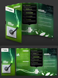
This brochure design that was featured on graphicdesignjunction.com stood out to me because of the bold color that was used throughout the whole background of the brochure. The contrast between the bright and dark greens draws the eye to it, making someone want to pick it up and read it. One of the main reasons this design is successful is because of its cover. Right away without reading anything on the brochure, you can assume that it is about power and electricity. Within the brochure, the designer stuck with a green theme and used white, black and lime green within the text. The colors stand out well on this dark green background. Not only does the text stands out, but it is also easy to read. Throughout the brochure, the designer chose to keep all of the headings in the same font. This gives the brochure a sense of unity even with the text colors being different. The way the designer made the beginning letter of the type larger and bolder brings the reader’s attention to that part of the writing. This brochure also does not have type overload. The purpose of a brochure nowadays is to get people to go to your website. This is a good way of laying out the important facts and not overwhelming the reader. Not only did the designer use an image on the cover of the brochure, but they also decided to add one on the inside panel with a few other background graphics. This is a good way to make sure a brochure is not going overboard on the type or leaving too much white space in the design. The only critique of this design that I can notice off hand is the title of the brochure. The designer could have laid out the business’s name so that it is more pleasing to the eye. It looks as if it was just placed in the corner without any thought. Overall, this designer created a good brochure with design hierarchy and proper color choices.

Head In The Clouds


This brochure was also found on graphicdesignjunction.com. This brochure grabbed my attention because of the graphics on the cover. It was eye catching that the designer decided to put all the social media logos on the cover as if they were floating on a cloud. Social media, for the most part, tends to be light and fun. The designer portrayed that well in their design by using light colors and fluffy cloud graphics. The layout of this brochure does a good job with design hierarchy. On the inside panel, the text starts off on the whole page, then is followed by a center picture with smaller text all around it. It then has more text underneath that is placed evenly below the middle graphics. This brings your eyes to the middle where the important text seems to be placed. The designer carried the social media logo graphics to the inside of the brochure which gives it some liveliness among all the text. The headings on the type are larger than the text bellow which allows the reader to know what each section is about easier. Under the headings is a smaller darker type. This is also good so that it will be easier for the reader to see when looking at large amounts of type. The font goes along with the fun and light style of the brochure. The designer seemed to use color to separate specific parts of the text. This makes it clear for the reader to tell the difference between specific information. There is just enough text in this layout to get the message across without it being overwhelming. The use of social media logos through the design keeps the reader engaged. The designer also used the cloud graphics to fill white space within the layout. The only thing I would personally change on this layout is the small text that is underneath the title of the brochure on the cover. I cannot read what it says, but it looks misplaced, like it is not supposed to be there. If for some reason it was necessary to the brochure, a different color text along with a larger style font would make it look much nicer. Overall, I think the design of this brochure was completed well. Fun and inviting styles make people want to read what you wrote, and that is the whole point of creating a brochure. I would defiantly use some of these elements in my own brochure if I were to create another one.


Tuesday, November 3, 2015

Postcard: 1   Nicole: 0

This postcard was an essential exercise in many ways. This project allowed the class to be able to use the skills we learned making our flyer in InDesign, editing pictures in Photoshop and creating artwork in Illustrator. Repetition is the key to being successful at any specific thing wither it is a sport, a skill or just an activity.  Having the opportunity to use the skills we’ve learned during the previous weeks gave us the chance to use repetition in our work.
            This assignment made me a lot better with working in layers. I have a better understanding now when it comes to working in layers, both InDesign, and Photoshop. I never used to click on the layer that I was working on before I saved it, which made transferring the image to another template a disaster. After working in layers time and time again, I have begun to automatically click the appropriate layer before saving.
             We were taught how to silhouette an image a few weeks into the semester, but I never had to use it in any other project, so when it came time to do it for the postcard, I was lost. This project made me have to actually look things up by myself on YouTube to be able to complete the project in time. I am grateful for that. I think that sometimes when you teach yourself to do something it really sticks with you.
            My poster was all about my travel experiences. The color of background that I used was a deep yellowish, orange. When I picked this color, I thought about the different sunsets I have watched throughout my travels. Aside from color metaphorically fitting into my poster, it contrasted well with the colors I was wearing in my silhouetted portrait. Lastly, the color was bold and vibrant which I believe is fitting for my personality.
             I also used color in my design of the world. I created a globe in Illustrator to use in my postcard. I used a lighter green and blue for the graphic so that it would not be so harsh on the yellowish, orange background. I also gave it a blended filter so it was easier on the eyes. My hand is extended in the silhouetted portrait of myself, so I thought it would be appropriate to be holding the world in my hand to give the reader and idea of what the postcard is about.
            The font is where I ran into some trouble. Unfortunately, when it came to finding fonts and working between two computers, the fonts did not save properly. Since the postcard project, we went over how to package fonts into a zip file which will come in handy when working on other projects. For the postcard, I wanted to stick with the bold theme as well as giving it the feel of being a travel postcard. The fonts I used for the summited postcard was fonts that had to be changed last minute due to the saving problems. The fonts were Chasing Embers and American Type Writer Light.  I used Chasing Embers for the title of my postcard, where I used a quote instead of my name. I also used Chasing Embers for the font of my name at the bottom. I used American Type Writer Light for the body of my text. I thought it looked clean and legible. Looking back at it now, I would defiantly not choose those fonts again.
            To give my design proper design hierarchy, I used two oversized quotations in the quote that was the title of my postcard. This gave the postcard balance. It extended the title, so it was the largest and boldest sentence on the postcard. From there the body of the text was under the quote, which followed by my name. My name was centered at the bottom of the page under the body so that everything stacked upwards. 

             Overall I think that this project has taught me the most about the Adobe Suite. Even though our poor Professor was about to rip out her hair, it was extremely beneficial. I am a lot more comfortable in InDesign, Photoshop and Illustrator than I was before. Someone in the library when I was working on my postcard asked me for help to get their background that they had gotten off the Internet onto their InDesign page, and I actually knew how it do it. Although I am not a master of Adobe by any means, it feels good to know that all of this information is being absorbed, even if it may be taking longer than expected.